
Bengaluru, India
The Problem
Act One: The Cloud Trial
What we put in front of clients
What the trial proved, and what it did not
The Pivot: Move the Product, Not the Data
Designing for the Desktop, and for Chat
The desktop was genuinely new ground
Chat turned out to be a content design problem
Keeping the Human in the Loop
The Compliance Side
The Knowledge Graph
What the Numbers Said
How It Evolved
Lessons
FAQ
Try it live
Work
/Case study: Compliance Autopilot
CybersecurityAI ProductsDesktop ApplicationsContent DesignDesign SystemsB2B

Ofofo Compliance Autopilot: The AI That Never Leaves the Building

Mohammed Zabeeh·July 23, 2026·21 min read
Ofofo Compliance Autopilot: The AI That Never Leaves the Building

Security questionnaires and compliance audits take months. A cloud trial proved AI could do the drafting in minutes, then the research said the clients who needed it most could never upload their evidence to anyone. So the product moved onto their machines.

30 days to 30 mins
Questionnaire turnaround
97%, 100% reviewed
Answer accuracy
32,160
Hours saved for clients
$271K
ARR in four months
Client
Ofofo
Role
Product Designer
Timeline
2025 to 2026
Type
App
Tools
Figma, FigJam, Design Systems

The Problem

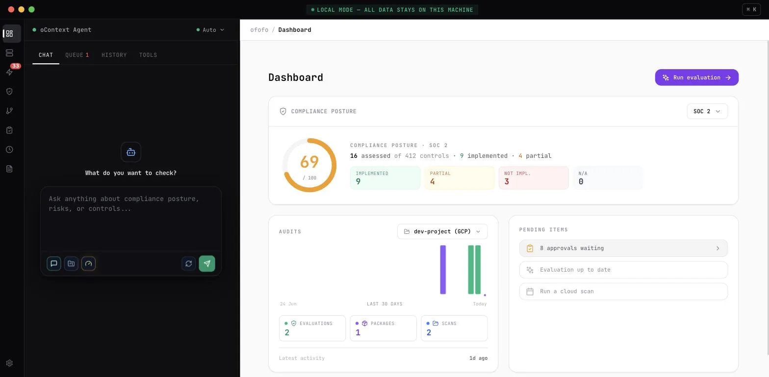
Before a company can sell software to a bank, it has to survive the bank's security review. That review arrives as a spreadsheet, often several hundred rows long, asking how data is encrypted, who can reach production, how often access is reviewed and what happens when something breaks. Someone has to answer every row, find the policy document that proves each answer, and send the whole thing back. Then the next customer sends a different spreadsheet asking the same things in different words. The cost of that ritual is not subtle. Sales teams lose around a fifth of their time to security activity, CISOs lose around forty per cent of theirs to assessing vendors, and deals slip by six to eight weeks with materially lower win rates at the end of it. One CISO put it plainly during research: "The security review process is broken." The compliance posture dashboard showing a SOC 2 score of 69 out of 100, with counts of implemented, partial and not implemented controls The obvious answer in 2025 was to point a language model at it. The interesting part is what happened when we did.

Act One: The Cloud Trial

What we put in front of clients

The first product was a web application, invite only, given to a small set of clients to use on real work rather than watch in a demo. Signups were approved by hand, usage was metered, and the whole thing was deliberately shaped as a trial rather than a launch. Two flows carried the idea. In the first, a client uploaded their supporting material, security policies, infrastructure and HR policies, past completed questionnaires, certifications, and then handed the assistant a questionnaire to answer against that material. In the second, the same evidence was mapped against a compliance framework, so each control in SOC 2 or ISO 27001 came back marked implemented, partially implemented or not implemented, with a confidence score and the reasoning that led there. That second part mattered more than it looked. A questionnaire answer is a claim, and a claim without evidence behind it is just a sentence. Tying every answer back to a document the client had actually uploaded is what separated this from a chatbot writing plausible security prose.

What the trial proved, and what it did not

The automation worked. Clients got answers back in minutes that had previously taken weeks, and the drafts were good enough to edit rather than rewrite. The blocker was somewhere else entirely. To answer a security questionnaire well, the system needs the company's policies, its audit history, its architecture notes and its previous answers. That collection is, almost by definition, the most sensitive material the company owns. It is the exact bundle a security team exists to keep from leaving the building. So the pattern in the research was consistent and awkward. Clients liked the output and would not feed it the input. Some were blocked by regulation, with RBI data residency rules and India's DPDP Act shaping where their data was allowed to sit, and SEBI requirements sitting on top for regulated entities. Others were blocked by their own policy, which simply prohibited putting compliance material into a third party cloud tool, regardless of how good it was. And a few had no rule to point at and still said no, which is its own kind of answer. Demand was proven. Trust was not. The product was never going to convert its way past that, because the objection was not to the automation, it was to the address.

The Pivot: Move the Product, Not the Data

The decision was to stop asking clients to send their evidence somewhere and instead send the product to the evidence. The second version is on premises, a desktop application that installs on the client's own machine and keeps everything local, the documents, the search index, the generated answers and the model itself. The first run setup screen with a persistent banner reading Local mode, all data stays on this machine, and a three step wizard for connecting clouds, choosing a model and indexing the dataroom That banner across the top is the most important piece of interface in the product. It is not decoration and it is not a marketing line. In the trial, the single most common question at the start of every conversation was a version of "where does this go". Answering it once in an onboarding modal was not enough, because the anxiety returns every single time someone uploads a document. So the guarantee is stated permanently, in the frame, on every screen, and it never scrolls away. The setup flow underneath it follows the same logic. Three steps, in the order the worry occurs: connect what you want scanned, choose which model does the thinking, and index the evidence. The model step is where the local first promise gets specific, because the client picks between a model that runs entirely on their own hardware and a cloud model they supply their own key for. Nothing is chosen for them and nothing is hidden. The tools panel listing the query layer, compliance runner, report generator and local SQLite store, each showing a running or active status Making the machinery visible was a deliberate choice too. A local runtime panel that names each component and shows whether it is running reads as reassurance rather than clutter to this audience. These are people who are professionally suspicious. Showing them the parts is more persuasive than promising them the whole.

Designing for the Desktop, and for Chat

The desktop was genuinely new ground

This was the first desktop application I had designed after years of web work, and the assumptions did not transfer as cleanly as I expected. A desktop app has its own frame, its own window behaviour and its own conventions for where things live. Interactions that feel obvious in a browser, the back button, the page reload, the link you can send someone, either do not exist or mean something different. Decisions I would have made without thinking on the web had to be reconsidered from the ground. The layout that settled it splits the window: the agent lives permanently on the left, and the right side is whatever you are looking at, the posture dashboard, the controls, the findings. The conversation and the evidence stay on screen together, so nobody has to remember what the agent just said while they go and check whether it is true. The agent mode selector open, showing four modes: Scan, Ask, Fix and Questionnaire The agent has four modes, and naming them honestly did more work than any visual treatment could. Scan looks at connected cloud accounts, Ask answers questions about posture, Fix proposes the specific commands that close a gap, and Questionnaire takes a vendor spreadsheet and answers it. Four verbs, each describing what actually happens. An earlier instinct was to hide the modes and let the agent infer intent from the message, which is the fashionable pattern. It was wrong here. These users want to know which machine they just started, because the consequences of each differ enormously.

Chat turned out to be a content design problem

This was the hardest part of the whole project, and it was not visual at all. When the interface is a conversation, there is very little to design in the traditional sense. What there is to design is language. How do you ask someone for a file without sounding like a form. How do you explain that an answer came from their own uploaded evidence rather than from a model's general knowledge, in one sentence, to someone who is not going to read a second sentence. How do you say "this ran on your machine" without it reading as a technical detail. And how do you hand back a spreadsheet, which is the actual deliverable, so that it feels like a result rather than a file appearing. The agent in questionnaire mode answering a question about data encryption, with the reply naming the dataroom and the most recent scan as its sources Every reply had to declare its provenance before its content. The answer opens by saying where it looked, the client's own dataroom and their most recent scan, and only then says what it found. The reverse order tested badly, because a confident paragraph of security prose with the sourcing tacked on at the end reads as the model's opinion, and once it reads as opinion nobody trusts it enough to send it to a bank. The input side needed the same care. Switching to questionnaire mode changes the composer's prompt to say exactly what to paste and in what shape, one question per line, because a generic "ask me anything" box in front of someone holding a 200 row spreadsheet is an unanswered question about what to do next. Failure copy follows the same rule and names the fix rather than the fault, telling the user their documents need indexing first rather than reporting that something went wrong. The output is the least glamorous and most important detail. What comes back is a spreadsheet in the same shape the client received it, saved into their local dataroom, because the thing the customer actually wants is not a conversation. It is the file, filled in, ready to send back to the bank that asked.

Keeping the Human in the Loop

Automation alone was never going to be enough here, because the person who signs a completed security questionnaire is personally accountable for what it says. A 97 per cent accurate answer sounds excellent until you are the one signing it, at which point the interesting number is the other three per cent and where it is hiding. The actions list filtered to the human in the loop tab, showing five items awaiting review with critical, high and medium severity labels So review is a first class part of the flow rather than a courtesy. Anything consequential lands in a queue tagged for human review, sorted by severity, with the agent pausing rather than proceeding. The chat states the pause in plain language, saying how many items need review before it can continue and offering one way to go and deal with them. The framing that made this work commercially was treating the reviewer as a user of the product rather than a gate on it. Ofofo runs a network of virtual CISOs, and the design goal was that the vCISO uses the AI too, moving through a prepared queue with the reasoning and the source evidence already attached, instead of auditing the machine's homework from scratch. That is what turns the accuracy story from 97 per cent into 100 per cent, and it is why the review step reads as leverage rather than friction.

The Compliance Side

The questionnaire is the sharp end, but the same evidence answers a broader question, which is whether the company is actually compliant rather than merely able to describe itself as compliant. The compliance controls browser showing individual controls with status labels, filters for status, domain and framework, and a total of 1451 controls Controls are browsable across a catalogue of over 1,400, filtered by status, domain and framework, with each one drilling down to the specific cloud resources that failed it. Assessments run per project and per framework, so a client can see SOC 2 at 73 per cent on one environment while ISO 27001 has not been started on another. The assessments screen showing SOC 2, ISO 27001 and NIST CSF status across a GCP project and an AWS account The design principle running through all of it is that a score is never presented without the reason underneath. Every number opens into the controls that produced it, and every control opens into the resources and evidence that decided it. In a product whose entire value rests on being believed, a figure you cannot interrogate is worse than no figure at all.

The Knowledge Graph

Underneath the answers sits the structure that makes them checkable. As documents are indexed, the product pulls out the things they mention and the relationships between them, building a knowledge graph that links a document to the passages inside it, those passages to the entities they describe, and those entities to the controls and frameworks they satisfy. When an answer cites the client's own evidence, this is the structure it walked to get there. The knowledge graph in its two views side by side: a light 2D layout on the left with labelled nodes and visible connections, and a dark 3D view on the right showing the same network as a spatial constellation The graph ships in two views, and the split is a real answer to two different questions rather than a novelty. The flat 2D view is for tracing: nodes are labelled, edges are followable, and it is the view you use when the question is specific, such as which document is holding up a control. The 3D view is for shape: it drops the labels and shows the network as a constellation, which is how you see clusters, density and the parts of the estate that nothing connects to at all. A sparse region in the 3D view is a genuinely useful signal, because in compliance the gap is usually the finding. Honesty about this screen matters, because it is the one that demos best and therefore risks becoming decoration. The rule I held to was that it had to answer a question the other screens could not. It earns its place because "why did this control fail" and "where did this answer come from" are questions about relationships, and relationships are exactly what a list of controls cannot show you.

What the Numbers Said

The figures below come from Ofofo's own product and revenue tracking rather than from my instrumentation. The headline promise moved a process that took around thirty days into one that takes around thirty minutes. Auquan used the questionnaire flow to answer 178 questions in under half an hour, at 97 per cent accuracy from the AI alone and 100 per cent after review, with a total of one hour of CISO involvement against what had previously been days of it. LattIQ reached ISO 27001:2022 certification in under a week, with 34 policies drafted by the agent and four hours of CISO time spent on the whole exercise. Across the platform the pattern held: 32,160 hours saved for clients, 67 virtual CISOs working through the review queues, an NPS of 83, and $271K of annual recurring revenue inside four months with a pipeline above $2.2 million behind it. The number I care about most is the four hours of CISO involvement, because it is the one that proves the human in the loop design worked. The expert did not get replaced and did not get buried. They got the boring 90 per cent done for them.

How It Evolved

Late 2025
The cloud trial
An invite only web application put questionnaire automation and evidence backed control evaluation in front of real clients on real work. Approval gated signups and metered usage kept it honestly framed as a trial rather than a launch.
Early 2026
The research verdict
Clients liked the output and would not upload the input. Regulation, internal policy and plain discomfort all pointed the same way. The blocker was not the automation, it was the address it ran at.
Early 2026
The on premise decision
Rather than convince clients to trust the cloud, the product moved to their machines. A desktop application with local storage, local document processing and an optional local model, with cloud models available only on the client's own key.
Mid 2026
Four modes and the review queue
The agent settled into Scan, Ask, Fix and Questionnaire, each named for what it does. Consequential actions were routed into a human review queue so a vCISO signs off before anything counts, which is what took accuracy from 97 per cent to 100.
Mid 2026
Cutting the last cloud ties
The remaining dependencies on the hosted platform were removed, including file sync and billing. What began as a cloud product with a desktop client ended as a desktop product, which is the opposite of the direction software usually travels.

Lessons

  1. Where the data lives can be the design decision No amount of interface work would have solved this. The objection was architectural, and the only honest response was to change the architecture and then design the experience that made the change legible. The permanent local mode banner is not a feature, it is the product's entire argument written where it cannot be missed.
  2. When the interface is a conversation, the design work is language There were no screens to art direct in the part of this product that mattered most. There were sentences: what the agent asks for, how it declares its sources, how it explains a pause, how it hands back a file. Getting the order of a sentence wrong, sourcing after content instead of before, cost more trust than any layout choice ever could.
  3. Do not hide the modes The fashionable pattern is to let the agent infer what you want. With users whose job is professional suspicion, naming the four things it can do was worth more than the elegance of hiding them. People want to know which machine they just started.
  4. Design the reviewer in, not as a gate Treating the vCISO as a user of the product rather than an obstacle to it is what made the trust story work. They arrive at a prepared queue with reasoning and evidence attached rather than a pile of machine output to check. Same accountability, a fraction of the hours.
  5. A number you cannot interrogate is worse than no number Every score in this product opens into the controls beneath it, and every control opens into the evidence beneath that. In a category built on being believed, an unexplained figure invites exactly the doubt you were trying to remove.

FAQ

Because the cloud version is what produced the finding. Clients using it on real questionnaires proved the automation genuinely saved weeks, and the same clients showed us exactly where they stopped, which was at the upload. Without the trial we would have been guessing about both the value and the objection, and we would probably have built the on premise version for the wrong reasons.

The application installs on the client's own machine and everything material stays there. Documents are parsed locally, the search index sits locally, generated answers are written to a local dataroom, and the reasoning model can run on the client's own hardware. If they prefer a cloud model they supply their own key, so the relationship is between them and the model provider rather than routed through us.

They index their evidence once, the policies, certifications and past questionnaires they already have. Then they hand over a vendor questionnaire, either as a file or pasted one question per line. The agent searches their own indexed evidence per question, drafts each answer from what it finds, and writes a completed spreadsheet back into their local dataroom in the shape it arrived.

By sourcing and by review. Every reply states where it looked before it says what it found, so an answer reads as evidence backed rather than as a model's opinion. Then anything consequential waits in a review queue where a virtual CISO signs off, with the reasoning and source evidence attached. That combination is what takes 97 per cent accuracy to 100.

The conventions I did not know I was relying on. No back button, no reload, no shareable link, a window frame with its own rules, and a layout that has to hold two things at once because there is no page to navigate away to. Beyond that, the interface was largely a chat, so most of the design work turned into content design, which is a different craft from arranging screens.

Design Skills

Product StrategyUX ResearchContent DesignInformation ArchitectureInteraction DesignDesign Systems

Tech Stack

FigmaFigJamDesign Systems