
The Problem I Walked Into
When I joined Ofofo, the marketplace was already live and already leaking. People were arriving, and then they were leaving. Onboarding was not smooth, so new users dropped off before they ever became buyers or sellers. The checkout lost people at the exact moment they had decided to spend money. And the marketplace itself was confusing to navigate: buyers could not tell where to start, sellers were registering as buyers by mistake, and the site's structure reflected how the company thought rather than how its users shopped. The tempting move is to start repainting screens. The dropoffs were on specific pages, after all. But a confusing marketplace is rarely a page problem. It is a journey problem. Before touching a single screen, I needed to know who was dropping off, at what moment, and what they were trying to do when the experience failed them.Finding the Breaks
Before redesigning anything, three pieces of groundwork located exactly where and why the experience was failing.Personas Before Pixels
The first gap I found was that we did not really know our users. The platform served two fundamentally different audiences, and the design treated them as one. On the buying side, the core persona is not a security expert. They run a small SaaS company or a fifty-person business, they have been told they need a penetration test or a compliance certificate to close an enterprise deal, and they are one bad acronym away from giving up. That persona thinking later became product surface directly: the resilience models feature opens by describing the buyer back to themselves, "You are a small SaaS company with a lot of big dreams but your team of less than 10 people," and recommends a security bundle to match. On the selling side, we had two personas in one door: security companies with catalogues of offerings, and individual consultants such as virtual CISOs selling themselves. Naming these personas explained the dropoffs. Buyers bounced because the site spoke security jargon to people who do not speak it. Sellers mis-registered because the platform never asked who they were until it was too late. Onboarding leaked because it demanded enterprise-length forms from people who just wanted to look around.Mapping the Journeys
With the personas named, I mapped their journeys end to end: a buyer's path from "I have a security problem" through discovery, evaluation, trust-building, purchase and follow-up; and a seller's path from landing to listing to first sale. Then I drew the whole platform as one task flow, so every screen we would later design had a place in a journey rather than a place in a sitemap.
The map forced the two decisions that mattered most for the dropoff problem. First, the site's odd front door had to go: the old header offered "Sign In", "Buyer" and "Become a Seller" as three parallel choices, and people picked wrong constantly. The redesign gave buyers and sellers one registration flow that forks at a single "select user type" step, then diverges into role-appropriate onboarding: an optional profile form for buyers, and company or individual onboarding plus a Stripe form for sellers, with role switching built in from day one. If people will get the door wrong, make changing rooms cheap. Second, the map argued for asking for commitment only after delivering value: optional profiles, coupons deferred to checkout, and a guest checkout path designed down to the email-and-OTP detail, though that last one never made it to production.
Card Sorting the Mental Model
The journeys told me where the experience broke. To fix the "confusing marketplace" part, I needed to know how people actually grouped what we sold. So I ran three open card sorts in FigJam: one with the dev team on the home and marketplace pages, and two with the executive team covering the landing page and the marketplace. Six participants, each writing and sorting their own cards, so the exercise doubled as idea generation and structure-finding.
The convergence was the finding. Search, filters, categories, pricing and testimonials formed near-identical clusters across both cohorts, which told us the core IA was not controversial, it just had never been applied. The seller-as-buyer registration confusion surfaced here independently too, confirming what the journey map predicted. And the executives kept reaching for hotel-booking comparisons ("filters like hotel booking apps"), which became the benchmark for how shopping should feel. One idea, seller-side cloning of offerings, was explicitly parked with a note to revisit for the admin panel: research producing a backlog decision, not just a diagram.
Designing the Buying Journey
With the breaks located, the browse-and-evaluate journey was rebuilt across three design cycles.Wireframes: Two Ways to Browse
The lo-fi stage staged a bake-off between the two classic marketplace layouts: a persistent left sidebar of filters beside list-style results, versus a filter panel behind a button with a card grid. The sidebar variant read like enterprise software, which was precisely the feeling that was scaring our persona away. The grid variant read like shopping. The grid won, with applied filters surfacing as removable chips so the panel never had to stay open.
The Discovery Journey, Cycle 1
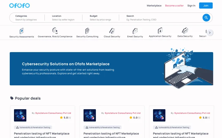
The first hi-fi cycle rebuilt the browse experience around how the buyer persona actually arrives: with a rough problem, not a product name. A structured discovery bar (Categories, Location, Budget, keyword) sat above a scrolling category rail and a "Popular deals" carousel, and the grid below always opened with an honest count ("123 offerings available"), because a buyer who cannot tell how big the shop is cannot tell whether it is worth their time.
The offering card carries a lot of weight in this journey, because a security offering is not a t-shirt. Each card holds the seller's name, star rating with review count, a category chip, a three-line description, and a pricing capsule that appears identically everywhere in the product: list price struck through, a green savings pill, the real price, the pricing model ("Fixed Cost | Starting from $10") and a "More Pricing" link with a count of the other plans. Buy Now and Compare sit side by side on every card, so the two most likely next steps are never more than one glance away.
Filters That Speak Security
The filter panel is where the buyer's evaluation journey either accelerates or stalls. Alongside the usual price range and ratings, buyers filter by delivery model, training model, support hours, frameworks coverage (OWASP, NIST, OSSTMM), compliance coverage (ISO 27001, GDPR, SOC, PCI-DSS, HIPAA) and, my favourite, certifications of the people on the job: CEH, OSCP, eJPT and more, each with live counts. A price histogram shows the distribution with a plain-language anchor: "The average price for an offering is $400," which quietly answers the question every first-time security buyer is embarrassed to ask.
The panel itself was a correction. An early direction leaned on compliance coverage as the hero filter, and it quickly became clear no single facet could carry a decision this layered. So every facet moved into one consolidated filter modal, and the panel became the place where all of them work together.
Even the dead end got designed. The zero-results state started as an apology and evolved into a recovery path: "Get Custom Quotation" turns a failed search into a lead, and "Show All Offerings" resets the funnel instead of stranding the buyer.
Cycle 2: Shortening the Path to Inventory
Cycle 1 proved the journey; Cycle 2 made it fast. Watching how people arrived taught us they come with a task, not a query, so the four-field discovery bar came out in favour of a single conversational search ("What cybersecurity services are you looking for?"), the tall hero banner disappeared, and category discovery moved into a mega-menu with live offering counts per subcategory and a pinned "Get Custom Quote" entry point. The page dropped from 5,197 pixels tall to 3,450: a third less scrolling between a buyer and the inventory.
Earning the Purchase
From trust to decision to payment: the second half of the journey is where the original funnel leaked hardest.Offering Pages That Earn Trust
The trust moment is where security marketplaces live or die. You cannot screenshot a penetration test, and our buyer persona cannot independently judge one. So the offering detail page layers proof instead: verified-purchase badges on reviews, a full ratings histogram, helpfulness voting, and a resource library where buyers preview sample deliverables, real report documents, in a lightbox before spending anything. For services, the page credentials the humans rather than the vendor: a "Certifications of the people on job" row with badge logos, plus frameworks and compliance coverage.
Services also introduced milestone pricing, rendered as a numbered stepper with a name, a completion bar, a dollar amount and a deliverables link per stage. That one component reappears across the detail page, the comparison table and checkout, so a buyer meets the same mental model everywhere in the journey.
Compare Without a Spreadsheet
Our journey map showed evaluation happening off-platform: two discovery calls and a spreadsheet. The comparison page brings that step into the product. Three columns, each swappable from a dropdown, with a dashed "Select Offerings" slot inviting the third. Attributes group into tinted bands (services, deliverables, support, certifications, frameworks, compliance, pricing model, milestones), and absence is communicated two ways: a dash for attributes a vendor simply lacks, and greyed-out text for unsupported items inside a checklist, so "does not have it" and "does not cover this part" stay distinguishable at a glance.
In use, seven of every ten buyers ran a comparison before purchasing. The ever-present "More Pricing" link resolves here too, into seller-scoped and category-scoped comparison pages, so a buyer can weigh one seller's three plans or one category's rivals without rebuilding their shortlist.
Rebuilding the Checkout That Was Losing People
Checkout was one of the original dropoff points, and the diagnosis was that it assumed one pricing shape (a price, a quantity, a total) in a marketplace that actually sells four. The redesign keeps the layout invariant, an order table beside a summary card, and lets only the price details block mutate:- Zero-dollar offerings keep the full flow, quantity stepper and all, with a $0 total, because a free security assessment still needs billing details and consent.
- Milestone engagements show the full value ($19,600) but total only the first milestone ($1,000), keeping the commitment honest and the first payment small.
- Discounts defer coupon entry with a quiet hint bar rather than cluttering step one.
- Subscriptions with trials earn the best detail in the flow: dual totals reading "Total after trial $100" and "Total due today $0", with the CTA relabelled from Checkout to Subscribe.
On mobile the flow becomes a three-step stepper: Order Summary, Billing Info, Confirmation, so buyers always know where they are and how much is left. Success and failure each got a designed ending, with the failure state naming the exact purchase that failed and leading with a retry.
Talking Before, and After, Buying
Security purchases are considered purchases, and the journey map showed a long quiet gap between "interested" and "paid" where buyers had questions and nowhere to ask them. The chat system fills that gap: a docked widget with a three-tab inbox (General, Orders and Support), each with its own unread count. Order threads pin the order ID at the top so the conversation stays anchored to the transaction, and pre-sale threads open from an offering context chip, so a seller always knows which listing a buyer is asking about. Presence states, read receipts, PDF and image attachments, and a designed end-of-life ("This conversation has been marked as closed") round out the lifecycle.
The Ecosystem Around the Journeys
The marketplace journeys sat inside a larger system that went through the same discipline. The landing page pivoted across cycles from a browse-first pitch ("We make small businesses resilient", with a segmented, faceted search bar in the hero) to a job-first one ("For CISOs. Buy CISOs.", hiring a virtual CISO in minutes), demoting search once it was clear buyers arrive with a task, not a query. Sellers got their own crimson-themed landing page and profile pages that expose revenue size, countries of operation and expertise categories, answering the seller persona's first question: will I be found here? A jobs board joined in a later cycle, complete with edge-case card variants for half-specified experience ranges. And resilience models packaged offerings into persona-matched bundles, pairing every capability with twin meters for security impact versus ease of implementation.What the Numbers Said
Every number here was measured, not felt: behaviour came from Microsoft Clarity and Hotjar (session recordings, heatmaps, funnels), and the qualitative side from feedback forms. The rebuilt marketplace UX lifted direct conversions by 56 percent and cut the bounce rate from 73 percent to 41 percent, movement that came from clearer navigation and decision flows rather than any single screen. Onboarding proved the ask-later principle: moving from everything-mandatory to letting users complete their profile as and when a task required it cut the onboarding drop rate from 83.5 percent to 53.1 percent. The comparison feature earned its keep, with seven of every ten buyers running a compare before purchasing. And the zero-results recovery path proved itself at scale once the RFP system launched, with six of every ten custom requests starting from that page.Platform Evolution
Lessons
- Dropoffs are journey problems wearing page costumes Every dropoff pointed at a screen, but no screen fix would have held. The checkout leaked because of what the journey demanded before it, and onboarding bounced because of who we imagined was filling it in. Diagnose the journey, then design the page.
- Personas are cheap, and designing without them is not The single most valuable early move was naming who we were designing for. The moment "SMB owner who does not speak security" was written down, half the existing site's decisions became visibly wrong, and the other half became defensible.
- Run the card sort before the debate The IA arguments that usually eat weeks resolved in an afternoon because both teams sorted the same concepts into nearly the same groups. Where they disagreed, that disagreement was itself the finding.
- Design the pricing capsule once, spend it everywhere The same price block appears on cards, detail pages, comparison columns and seller profiles. Buyers learned to read it once, and every subsequent surface got cheaper to design and easier to trust.
- Ask for commitment after value, not before Optional buyer profiles, coupons deferred to checkout, role switching for mis-registered sellers: every fix to the dropoff problem amounted to the same principle. Let people move forward first and formalise later. The boldest version, a guest checkout needing only an email and an OTP, was designed and mapped but never shipped.
- Empty states are acquisition surfaces The difference between "no results, sorry" and "no results, get a custom quotation" is a lead. Once the RFP system launched, six of every ten custom requests began on exactly that page. Dead ends in a marketplace are optional.
FAQ
Three compounding things. The site's structure reflected the company's org chart rather than buyers' mental models, so people could not find what they came for. Onboarding demanded long forms before showing value, so new users bounced. And the checkout assumed simple pricing in a marketplace selling milestones, trials and zero-dollar offerings, so decided buyers hit confusing totals at the worst possible moment.
Because the failing pages were symptoms. A checkout redesign cannot fix a buyer who arrived confused, and a prettier onboarding cannot fix a seller who registered through the wrong door. Mapping who the users were and what journey they were on located the actual breaks, several of which sat two screens before the page where the dropoff showed up.
They settled the marketplace taxonomy with evidence instead of opinion, confirmed the buyer-seller registration confusion independently of the journey map, and set the experiential benchmark: executives kept comparing the filtering they wanted to hotel-booking apps, which became the bar for how shopping should feel.
By changing only one thing. The layout, the order table, the summary card and the billing flow are identical for every purchase. Only the price details block mutates: milestone splits, trial dual totals, deferred coupons. Buyers get a consistent journey, and the complexity stays contained in the one component built to express it.
No single fix. The single registration flow with a clear user-type fork replaced the old three-way front door and stopped sellers landing in buyer accounts. Optional profile forms let buyers defer paperwork, cutting the onboarding drop rate from 83.5 to 53.1 percent. The rebuilt IA meant people arriving from search landed somewhere that made sense. And clearer decision flows carried buyers from category to card to checkout without dead ends. Each removed one reason to leave, and direct conversions rose 56 percent alongside.
Every cycle shipped desktop, tablet and mobile builds. Mobile was never an export: the lo-fi stage wireframed nine separate iPhone screens, and the checkout became a proper three-step stepper on small screens rather than a squeezed desktop page.