The Problem
Eating out should be the easy part of an evening. In practice, getting a table is the part that goes wrong. People call ahead and get put on hold, or they just show up and hope, then stand near the door waiting for a seat to clear. A plan made for 8 PM quietly slips to 8:40, and the rest of the night shifts with it. LineUp started from a simple question: why is booking a table still the most uncertain step in going out? The goal was an iOS app that removes the guesswork, lets anyone reserve a table at any restaurant without time or information constraints, and shows people where they will be seated before they ever arrive.Listening First
Before sketching a single screen, I ran a research round with 47 participants through surveys and interviews. I focused on two groups whose habits differ a lot: working individuals and families, aged roughly 18 to 50. The numbers told a clear story:- 61% said the main reason they visit restaurants is simply to have a meal, and 67% of that group eat out at least four times a week. This is a frequent, repeated behaviour, not an occasional treat.
- Families lean toward dinner with a predictable rhythm, while working individuals have no fixed pattern at all.
- 76% still book by calling the restaurant or by turning up and waiting for a table to open.
- A surprising number of people did not realise busier restaurants need a booking in the first place, so they arrived, waited, and left disappointed.
Making Sense of It
I pulled every note from the 47-participant round onto an and clustered the findings until the themes settled into 5 groups: editing bookings, search and filtering, the information shown during booking, restaurant selection, and the booking flow itself. A few insights shaped the rest of the project:- People wanted an edit option inside the booking page, not buried elsewhere, so they could change timings after confirming.
- They asked for richer filters and multi-filter search, so the app could match a real mood, not just a name.
- Several were confused about where they would be seated, which pointed straight at a visual seating preview.
- Confirmation needed to be tangible, ideally a to show at the reception desk.
- Repeat behaviour mattered: recurring bookings for weekly team lunches and saved occasions like birthdays or a couple's dinner.
The Solution
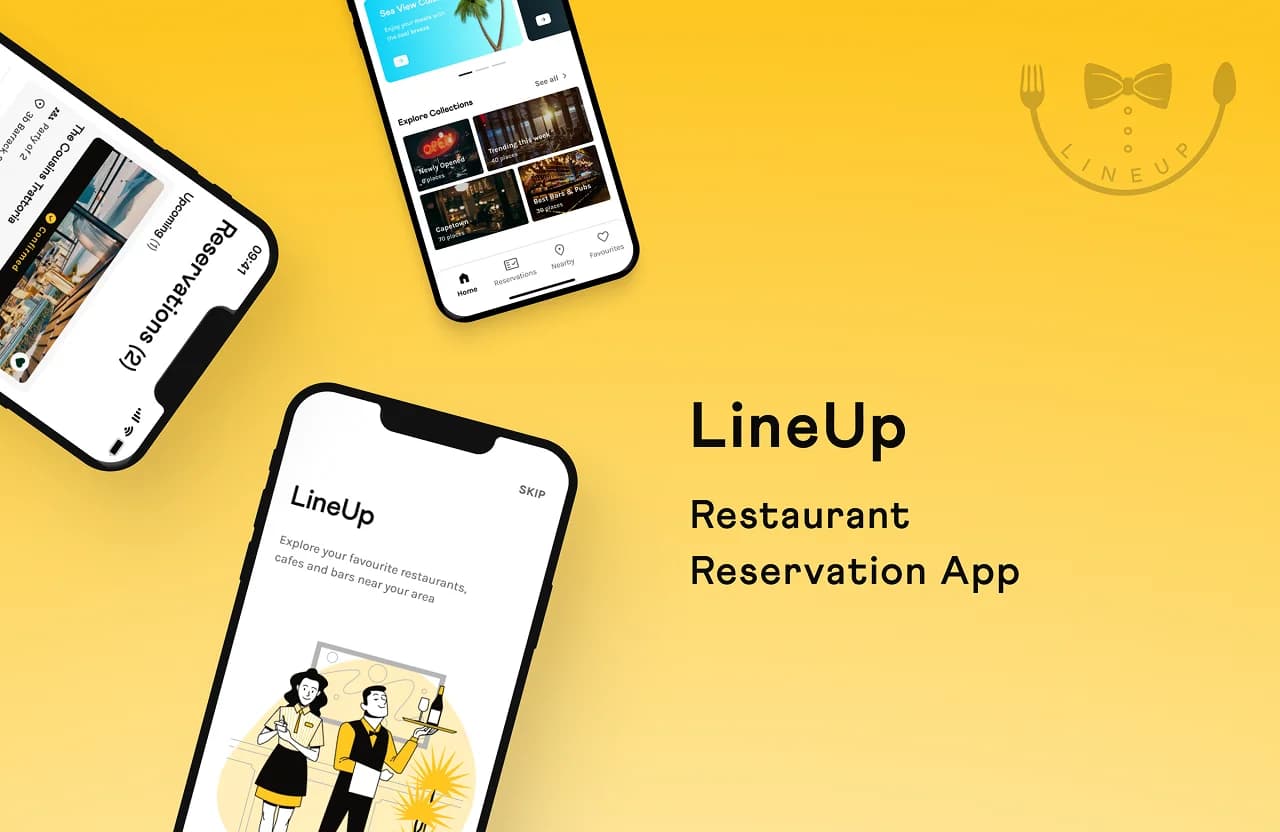
I designed LineUp across 28 screens around 3 ideas: book in a few taps, search the way people actually think, and remove the uncertainty of arrival. Search that matches a mood. The home screen leads with the user's location and a search bar, backed by a filter sheet with three layers: Sort (rating, cost, distance), Cuisine (Italian, Indian, Chinese, and more), and More (open now, outdoor, terrace, wifi, hygiene, wheelchair accessible, luxury dining). Recent and trending searches sit underneath, alongside a re-book shortcut for favourite spots, so a repeat booking takes seconds. A clear path to the table. From a restaurant page, choosing a date, party size, and slot flows into a visual representation of the dining space, so people can see roughly where they will sit instead of guessing. Booking ends on a confirmation screen with a to scan at reception, turning an abstract reservation into something real to hold. Reservations that respect routine. Upcoming and past bookings live in one place, editable from inside the booking itself, with recurring options for the weekly lunch crowd and saved occasions for the dates that come back every year.The Brand
Beyond the flows, I owned the visual identity as brand strategist. LineUp leans on a warm, confident yellow, a friendly bow-tie-and-cutlery , and soft illustrations that keep the tone relaxed rather than transactional. The system stays high-contrast and legible so the app feels calm under the small stress of a Friday-night booking.Reflection
LineUp was a self-initiated case study, designed and branded end to end over 8 weeks in . The most useful lesson was how directly research shaped the product: the seating preview, the multi-layer filters, the QR confirmation, and the editable bookings each trace back to a specific thing a participant said. Starting with people, then designing, kept the work honest about the problem it set out to solve, getting a table without the wait.Process
Lessons
- Every feature should trace to a sentence someone said The seating preview, the multi-layer filters, the QR confirmation, and editable bookings each came from a specific participant comment. When a feature could not be traced back to the research, it did not ship.
- The competitor was not another app 76% of people booked by calling or by showing up and waiting. LineUp was never competing with other booking apps. It was competing with a phone call and a hopeful walk-in. That framed every design decision around being faster and more certain than both.
- Show the thing people are uncertain about Participants could not picture where they would be seated, and no amount of copy fixes that. The visual seating preview answered the question directly and became the feature the whole product is remembered by.
- Confirmation needs to feel like a ticket An abstract "booking confirmed" message did not reassure anyone. The gave the reservation a physical presence, something to show at the desk, and that small artifact carried a lot of trust.
- Routine is a feature Weekly team lunches and yearly occasions came up again and again. Recurring bookings and saved occasions turned a one-off utility into something that fits how people actually eat out.
FAQ
Scope. As a solo 8-week case study, designing deeply for one platform produced better work than designing shallowly for two. The iOS conventions also matched the audience segments from the research.
That 76% of people still booked by calling or just turning up, and that many did not realise busy restaurants needed a booking at all. The problem was not a bad competing app. It was that no habit existed.
It removes the last unknown. People told us they were confused about where they would be seated, and uncertainty about arrival was the emotional core of the problem. Seeing the dining space before booking turns a guess into a choice.
Most platforms treat the booking as a row in a list. LineUp was designed around the anxious parts: mood-based filters to pick the place, a visual preview to pick the seat, a QR code to make arrival certain, and editing inside the booking so plans can shift without a phone call.
Validate the seating preview with live restaurant data, since hand-maintained floor plans would not scale, and run a pricing conversation with restaurants early. The design answered the diner's problem. The operator's side is the next case study.