
The Problem
Freelancers in India do their bookkeeping in March, which is another way of saying they do not do it. 11 months of receipts live in a pocket, a glovebox, and a WhatsApp chat with themselves. The tax number they carry all year is a guess, usually wrong in whichever direction hurts more. Then the asks for the books, and the books are a shoebox. Mine included. My own statement held over 1,000 transactions I had never categorised, and the honest answer to "how much tax should you have set aside" was a shrug. The product exists because that shrug got expensive. Every decision in the app answers one question: does this make the March handover to the better or worse?What It Is
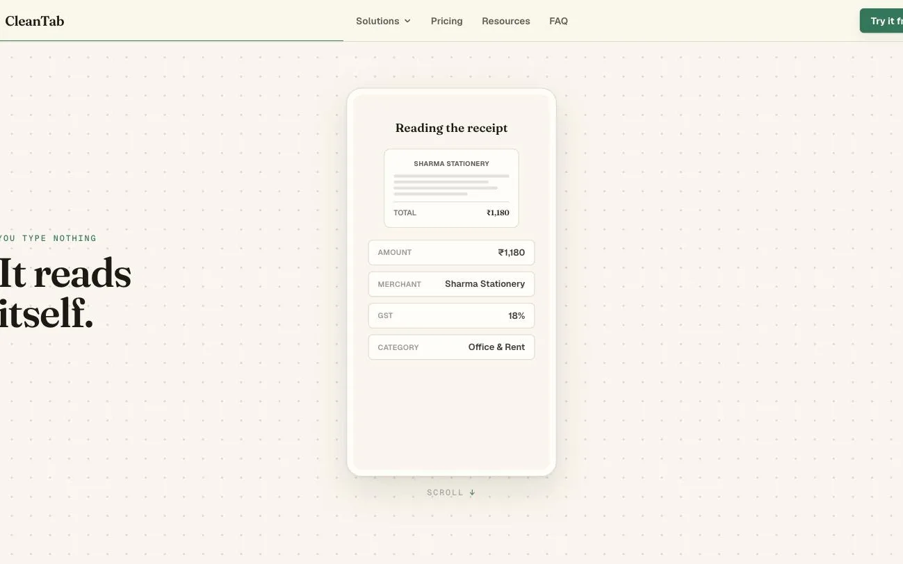
CleanTab is a phone-first that does the bookkeeping at the moment of spending, not 11 months later. Snap a bill and AI reads it: amount, merchant, GST, category, all filled before you have put the receipt down. Income works the same way, and the app tells you what to set aside for tax, per invoice, all year.Your Drive Is the Database
CleanTab keeps exactly 0 financial records on its own servers. The books live in the user's own Google Drive as plain CSVs and photos, in a folder they can open and take away. The app asks for the narrowest permission that exists, , so it cannot see anything it did not create. This is a design decision wearing an architecture costume. "We take privacy seriously" is a policy that can change with a funding round. "Your financial records are on your Drive, not on our servers" is a fact a user can verify by opening Drive. It also solves offboarding and sharing: leaving means not opening the app again, and handing the the books is a native Drive share, not an export feature.The Phantom Tax Bill
The app showed me a tax bill of ₹2,44,111 for the year. My accountant, reading the same bank statement, said ₹0. The accountant was right. The tax engine was never wrong. Of ₹24.28 lakh credited to my account that year, only ₹9.94 lakh was professional income. The rest was family transfers, credit card repayments, a loan disbursement, and money between my own accounts. The classifier had swept most of it in as income, and every rupee of the phantom bill flowed from that list. On a personal bank account, most credits are not income. Any design that assumes otherwise taxes your mother's birthday transfer. That inverted the classifier's posture. A credit counts as income only when something says so, and the row shows what: every ticked credit carries a plain-English reason, "15 payments from this payer across 11 months, reads like a client", with a confidence level. The review screen groups credits by payer instead of by date, so one decision covers 15 rows. Anything the classifier cannot justify lands in a "couldn't tell" bucket, unticked. The import screen carries more design weight than any other, because most users arrive in the worst month with the worst artefact, a whole year's bank statement. It splits into Money in and Money out, because credits are an income question and debits are a categorisation chore, and interleaving them reloads context on every row. The import runs long, so it says so. A progress dialog counts payers as they are judged, and the finished screen opens on the groups that need a human rather than the hundreds of rows that do not. Rows the app refuses to touch are locked with the reason stated on the row, because a tick that silently refuses reads as broken. Re-imports were designed for, not merely tolerated. Downloading an overlapping statement is the normal case, so the app spots the overlap and asks one question, update the existing import or bring it in separately, instead of quietly doubling a year of income. A row matching an existing entry on date, amount, and narration is barred from the write entirely. The doubling class of bug is closed at the door, not swept up afterwards. After the redesign, my books computed the accountant's figure to the rupee.The Salary Taxed Twice
The second bug was subtler and worth ₹1,28,582. My employer's 15 salary credits look like client income: a company name, regular payments, healthy amounts. The classifier ticked them as professional receipts, so the same money was taxed twice, once as declared salary and once as deemed business profit. No rule reading only the bank statement can fix this, because nothing in a statement says "employer". The fix reads the two together: a payer whose yearly total lands within a band of the declared salary, wide because the declared figure is gross while the bank sees pay after deductions, and who pays with salary-like regularity, gets flagged as the likely employer. Only the closest match, only ever one. That verdict ships with low confidence on purpose, so the review screen draws the eye to it rather than quietly settling it. A wrong employer guess silently absorbed would be the phantom bill with the sign flipped. The same humility shapes the salary settings: the app shows the salary it found in the books beside the declared figure with a button to adopt it, a proposal and never an overwrite.The March Handover
The finale of the product is a PDF. Send to builds a report from the live books: title page, contents, cash flow, financial statements, and the tax computation with every input shown. It prints what was credited beside what is taxed, "of which salary, of which professional receipts", so the CA never reconciles a smaller gross-receipts figure by guesswork. When exceeds the year's liability, the report says refund, in a row, rather than a negative number to interpret. Shipping it taught me a lesson about verification I have kept since. A release note claimed amounts now print the ₹ symbol. They did not. Every figure was still drawn in a face where ₹ renders as a superscript ¹, invisible in code review because only the rendered page was wrong. The eval now renders the PDF and reads the text back off the page. The same habit caught a receipt filed into the wrong financial year, making one document disagree with itself by ₹1,202.Selling It Honestly
The marketing site at cleantab.in is built on the product's own metaphor, a khata, a ledger that draws itself in as you scroll. The centrepiece is a scrollytelling pipeline that plays the whole product in one pinned scene, snapped to read to jarred to filed, so a visitor watches it work before a single feature is named. The pricing page is one comparison table and nothing else. Cards with adjectives got deleted, both plans sit side by side with every limit stated, and the yearly price is anchored to less than one filing. The privacy page could have been a list of negations. It became the site's one dark act instead, with the copy rewritten positive: "It all lives in your Drive." The site runs analytics behind an opt-in consent banner and the app runs none, and five places claiming "no tracking" were rescoped to say exactly where that is true rather than quietly deleted. The launch still had to be earned. The night before, an audit of my own product found the kind of bug that ends trust in a finance app: every plan and quota gate failed open when a request omitted its identity cookie, so deleting one cookie in devtools unlocked every paid feature. It also found two test harnesses green for weeks because they tested hand-copied versions of the real code, a lie with a checkmark. The gates now refuse without identity and every harness imports the code it tests. CleanTab launched on 27 July 2026, free tier for light use, Pro at ₹299 a month or ₹2,399 a year.Platform Evolution
Lessons
- Justify inclusion, never exclusion Verifying the glamorous part of a system while trusting the boring part is how a right answer becomes a wrong one.
- Assert on what the reader sees The artefact the user holds is the only truth worth testing.
FAQ
Because the user's books should survive the company. Drive means the data is readable without CleanTab, in CSVs Excel opens, shareable with a CA through Drive itself, and verifiably not on our servers. The app holds only plan and quota counters. The cost is real engineering pain, because Drive permits duplicate names and has no transactions, and that cost is paid on our side of the boundary rather than the user's.
Amount, merchant, GST, date, and a suggested category, extracted by Gemini from the photo or PDF. When a field cannot be read it stays empty and says so rather than guessing. A receipt dated in a different financial year is filed into its own year.
A section of Indian tax law for professionals that deems 50% of gross receipts to be profit and taxes that, ignoring individual expenses. It is why a freelancer's tax depends almost entirely on getting the income list right, which is exactly where the design effort went.
It has to justify the inclusion. Known clients, recurring payers with client-like patterns, and payments carrying professional markers get ticked with the reason stated. Personal-looking transfers land unticked in a couldn't-tell bucket. The one honest gap: a family member transferring money monthly can read like a client on recurrence alone, so recurrence-only verdicts carry low confidence and surface for review instead of settling silently.
The engine computes slab tax, the 87A rebate, advance-tax instalments, EPF and state professional tax where they apply, and it matched a practising accountant's figure to the rupee on a real year with 1,114 transactions. The number is as right as the income list, which is why the review experience is the real tax feature.
The phone is where receipts happen, and a PWA installs from a link, works offline, and sends reminders without a store gatekeeping releases. The desktop site shows a QR code that hands the session to the phone. A Play Store presence via TWA is on the roadmap.