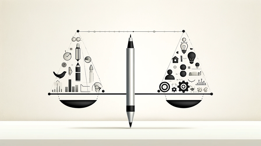
One of the never-ending debates we face in our field is finding the perfect harmony between simplicity and usability is like mastering the art of tightrope walking. This discussion is not just about minimalism or the abundance of features; It’s all about creating experiences that are easy to use yet deeply fulfilling. As a designer, I’ve grappled with these concepts every time, and I’d like to talk about on how to navigate this delicate balance that can make or break a user experience, with a few insights.
Why simplicity and usability matter
Simplicity in design means minimizing complexity by removing unnecessary elements or content that does not support user tasks. It’s about focusing on what’s essential, making it easier for users to comprehend and engage with a product or service. However, simplicity should not come at the expense of functionality.
Usability, on the other hand, encompasses how easy and intuitive it is for users to interact with a design to achieve their goals efficiently and satisfactorily.
A study by Lee et al. (2015) highlights that simplicity and interactivity are key determinants of usability in mobile phone design, significantly affecting user satisfaction, trust, and brand loyalty (Lee, Moon, Kim, & Yi, 2015). They found these elements can make or break user satisfaction, trust, and even loyalty to a brand. That’s a loud wake-up call for designers to keep a keen eye on these aspects.
The spectrum of simplicity and usability
Imagine simplicity and usability on a spectrum. On one end, we have ultra-minimalist apps that are easy to use but might lack comprehensive features. On the other, there are feature-rich platforms that can do a lot but may overwhelm new people using it. The fine line is drawn in the space between these extremes.
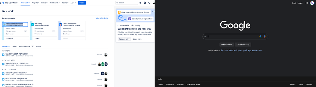
Don Norman’s “Simplicity Is Not the Answer” challenges the notion that simplicity equates to usability in design. He argues that people actually desire devices that are powerful, adaptable, and easy to use, not necessarily simple. The key is to design for usability by effectively managing complexity through modularization and clear conceptual models, turning complexity into a benefit. This approach emphasizes human-centered design over the mere reduction of features for simplicity’s sake
Products getting It just right
Apple’s iPhone
The iPhone revolutionized the smartphone industry by offering a device with a simple, intuitive interface while not skimping on functionality. Its design philosophy prioritizes simplicity, making it accessible to users of all ages and tech-savviness levels. The success of the iPhone demonstrates how simplicity and usability can drive user satisfaction and brand loyalty.
Google’s search engine
Google’s search engine is another prime example of simplicity in design. Its homepage is famously minimalistic, featuring mostly white space and a single search bar. This simplicity belies the complex algorithms at work behind the scenes, delivering powerful search functionality in an incredibly user-friendly package
Zoom
The video conferencing tool Zoom became indispensable during the COVID-19 pandemic due to its easy-to-use interface. Despite offering a range of features for different user needs, from casual catch-ups to professional webinars, Zoom maintains a straightforward design, making it accessible to users with varying levels of technical expertise.
Challenges and considerations
Achieving the right balance between simplicity and usability is not without its challenges. As noted by Sarkar (2023), while simplicity in design is desirable, it should not result in a loss of software power or flexibility. A too-simplistic approach can hinder the functionality and potential of a product (Sarkar, 2023).
Rousi and Silvennoinen (2018) discuss the cognitive-semiotic approach to design, suggesting that simplicity should not equate to reductionism. Instead, considerate complexity, or the careful organization of complex elements, can enhance both the aesthetic and usability aspects of a product (Rousi & Silvennoinen, 2018).
Finding the balance
Start with User Needs
The key to balancing simplicity and usability lies in understanding the people who are going to use your product deeply. What tasks are they trying to accomplish? What is their level of expertise? User research and testing are indispensable tools for uncovering these insights.
Prioritize Features
Once you know what people using your product need, prioritize features based on those needs. Not everything needs to be front and center. Use the Pareto Principle (80/20 rule) as a guide: 80% of users will use only 20% of your features most of the time. Focus on making that 20% as accessible and efficient as possible.
Employ Progressive Disclosure
Progressive disclosure is a technique where information or features are revealed as and when the product customer needs them. This approach keeps the interface simple for beginners, while still offering advanced functionality for power customers. It’s about revealing complexity in layers, based on the customers’s context and actions.
Leverage Design Patterns
Familiar design patterns and conventions can help manage the balance between simplicity and usability. For example, a hamburger menu might hide secondary options, keeping the main interface clean, while tabs or cards can organize information in an easily digestible format. These patterns help users navigate complexity intuitively.
Conclusion
As designers, our role to navigate the perfect balance between simplicity and usability is ongoing and dynamic, wherein we are constantly adjusting to find the sweet spot for the people who use our products. By having a deep understanding of user needs and behaviors, prioritizing features wisely, employing design strategies like progressive disclosure, and staying adaptable; We can create products that are both beautifully simple and profoundly usable. In the end, the goal is not to choose between simplicity and usability but to harmonize them in a way that feels almost invisible to the people using the product. That is the art and science of exceptional design.
The fine line: Keeping design simple yet functional was originally published in Bootcamp on Medium, where people are continuing the conversation by highlighting and responding to this story.