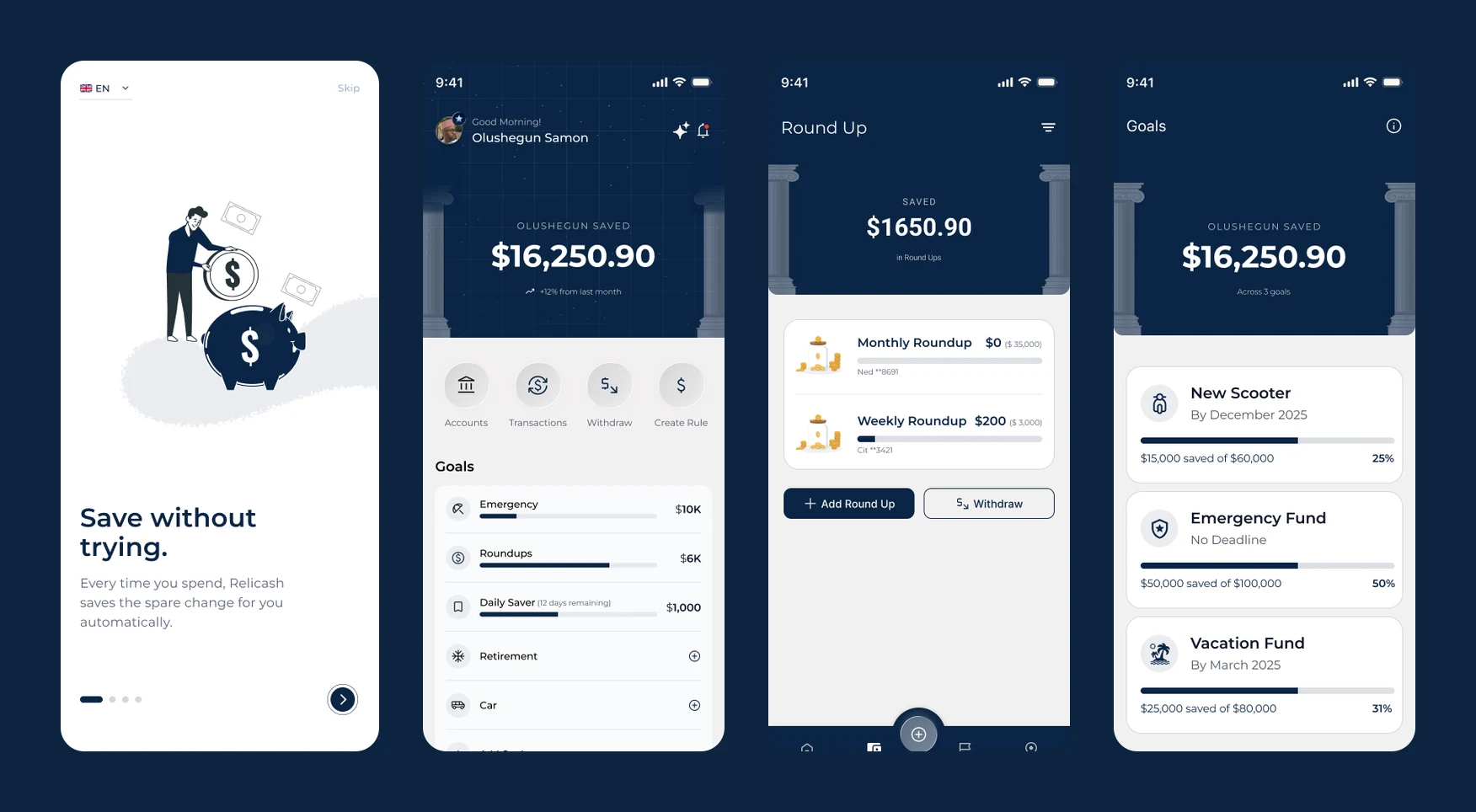
Relicash: Designing Savings That Happen Without Trying
Mohammed Zabeeh·June 11, 2026·12 min read
End-to-end product design for a micro-savings app: behavioral research, app architecture, a full data schema, and a 55+ screen UI covering round-ups, save rules, goals, challenges, and tiered memberships.
55+
Screens designed
11
Core flows
11
Data entities mapped
3
Membership tiers
Client
Olushegun Samon
Role
Product Designer & Researcher
Timeline
2025
Type
Consumer
The Problem
Most people do not fail at saving because they lack discipline. They fail because saving is designed as a decision, and decisions are exactly what people avoid when money feels tight.Every savings app asks the same thing: decide an amount, decide a date, remember to follow through. The decision is the friction. Relicash started from the opposite premise. What if the default was saving, and spending was what triggered it?That premise became the product's one-line promise, and the first walkthrough slide: save without trying. Every time you spend, Relicash saves the spare change for you automatically. Everything else across the app's 11 flows, goals, challenges, memberships, exists to keep that automation running and to make its results feel worth celebrating.
Research Before Pixels
The FigJam V1 structure document mapping every screen, error state, and USSD fallback.I treated the board as the actual product workspace, not a moodboard dump. 4 artefacts came out of it before a single UI frame existed.A full V1 app structure. 5-tab navigation, every screen listed with its contents, plus the unglamorous parts most concepts skip: error states (no internet, insufficient balance, expired session), notification flows, a referral loop, and an agent locator. The first draft even specified a fallback menu so the savings logic could work on feature phones, an idea that came from researching markets where smartphone data is expensive and mobile money agents are the real banking layer.A complete data schema. 11 entity groups, from users and status to wallets, transactions, goals, scheduled boosts, savings circles, and analytics events. Amounts stored in cents, transaction types limited to four (, boost, withdrawal, manual save), goals with auto-spillover flags. Writing the schema forced honesty: if a screen could not be expressed in those tables, the screen was decoration.The 11-group data schema, from KYC and wallets to circles and USSD settings.A . The piece of research I am most glad I did. Every retention feature candidate, savings streaks, achievement badges, time-boxed challenges, leaderboards within small circles, multiplier days, auto-increasing round-ups, jar visualisations, spin-to-win bonuses, gift-saves between friends, mapped against the specific motivational effect it produces: for streaks, social proof for circles, for the wheel. Features earned their place by the psychology they activate, not by how fun they sounded.The motivation matrix pairing each engagement feature with the psychology that drives it.A prioritized feature backlog. Everything from the matrix and structure docs sorted into expense tracking, savings automation, engagement, goal tracking, accessibility, security, and operations, each with a now/later call. The backlog is why the UI has 11 coherent flows instead of 30 half-finished ones.
The Design Language
Deep navy and white, with gold reserved for moments that involve money moving or status rising. The navy header treatment, with its subtle classical pillar illustration, frames every balance, on all 55+ screens, like an engraving on a banknote: the number is the hero, always in the same place, always in the same weight. Montserrat throughout for its even, geometric calm.The system deliberately avoids the candy-coloured gradients common in consumer fintech. Relicash holds people's emergency funds. The interface should feel like a calm institution that happens to fit in a pocket, and the restrained palette plus generous whitespace does that work.
Onboarding That Earns the Bank Link
Onboarding runs value first, then security setup, then the bank link with success screens.Asking someone to connect their bank account is the highest-friction moment in any fintech product, so the onboarding sequence is built as a trust ramp.4 walkthrough slides state the value proposition in escalating order: save without trying, one tap saves more, money that grows, let AI do the work. Then account creation with verification, then security setup (PIN plus Face ID) before the bank link, not after. By the time Relicash asks for a bank connection, the user has already seen the app take their security seriously. Every successful step gets an explicit green confirmation screen, because in a money app, silence after an action reads as failure.The flow (document scan, selfie, upload fallback) was designed with the same principle: show progress, confirm every completed stage, never leave a dead end.
The Core Loop: Round-Ups, Rules, and Goals
The dashboard leads with one saved total, above round-ups, goals, and challenges.The dashboard answers one question above the fold: how much have I saved? One number, $16,250.90 in the draft, with a month-over-month delta. Four quick actions sit directly beneath (accounts, transactions, withdraw, create rule), then the goals list with progress bars. Nothing on the home screen requires reading a chart.Round-ups are the engine. Each rule is named, assigned to a specific funding account, and tuned with a rounding increment. The round-up hub shows exactly what each rule has collected and feeds a single saved total. Withdrawing is deliberately a first-class button, not a buried setting: automation that feels like a trap gets switched off, automation that feels reversible gets trusted.Automation screens: save rules, a dedicated emergency fund, and AI-driven Smart Tips.On top of round-ups sit save rules (quick save, daily saver, monthly round-up sweeps), a dedicated emergency fund pot with its own add-funds flow, and Smart Tips, an AI layer that reads spending patterns and suggests the next rule worth creating. Goals tie it together: pick a target, pick a timeline (the form nudges with 3-month, 6-month, and 1-year presets), pick which account funds it, choose reminder cadence, done. The goal-created confirmation repeats every parameter back, the same honesty pattern as onboarding.Challenges convert the motivation research into UI: time-boxed sprints like a 30-day savings sprint or save $500 this week, each with explicit rules, a progress preview, and a real cash reward for completion, not points. The joined state immediately shows the streak calendar, because a challenge without a visible day counter is just a wish.
Memberships: Paying for Power Tools
3 metal membership cards, Silver to Platinum, priced by capability rather than basics.Monetisation is a , presented as metal cards: Silver at $15, Gold at $25, Platinum at $30 a month.The tier logic follows capability, not paywalled basics. Silver covers the automation core: smart round-ups, daily micro-saves, target trackers, and an overdraft shield. Gold adds the behavioural layer: multiplier rules, life RPG quests, micro-investing, and smart savings. Platinum is the wealth layer: AI wealth routing, tax-loss harvesting, and a VIP concierge. Free users still save. Paying users save smarter. Each tier page uses the star motif from its card, so status is legible at a glance anywhere it appears in the app.
Platform Evolution
Sep 2025
Research and app structure
Competitor audit, the V1 app structure document, full data schema, and the prioritized feature backlog, all assembled on the FigJam board before any UI work.
Sep 2025
Motivation matrix
Every engagement feature candidate mapped to the psychological mechanism it activates: streaks to loss aversion, circles to social proof, spin-to-win to variable reward.
Oct 2025
Brand and moodboard
Navy and gold direction, Montserrat type system, Storyset illustration style, and the classical pillar motif for balance headers.
Oct 2025
UI Draft 1
55+ screens across 11 flows: onboarding and KYC, dashboard, round-ups, save rules, goals, challenges, emergency funds, smart tips, profile, and memberships.
Now
Investor showcase
High-fidelity screens packaged for the investor-showcase phase the product is currently in, ahead of the build.
Next
Build for the US, then Africa
Ship to US users first, the launch market, then extend to African markets, where the schema's USSD settings, agent locator, and data-saver mode already make the inclusive version buildable without a rewrite.
Lessons
Research the behaviour, not the feature
The changed more design decisions than any visual exploration. Knowing a streak counter works through tells you exactly where it belongs on the screen and what happens when it breaks.
Write the schema before the screens
The data schema was a design tool, not an engineering handoff. Every screen had to map to real , which killed several attractive but hollow ideas early.
Automation must look reversible
Withdraw sits next to every saved balance. People only let software move their money automatically when stopping it is visibly one tap away.
Confirmation screens are trust infrastructure
Every committed action in Relicash echoes its parameters back on a success screen. In fintech, ambiguity after a tap is indistinguishable from a bug.
Gamification has to pay real money
Points decay into noise. A $50 reward on a completed 30-day sprint keeps the game honest, and the unit economics of that reward forced sharper thinking about the membership pricing.
FAQ
Scheduled transfers fail at the exact moment people need savings most: when money is tight, the transfer gets cancelled and the habit dies. Round-ups scale with spending automatically. Spend less, save less, but never zero, so the streak survives lean weeks.
It is sequenced, not dropped. Relicash launches in the US first, so UI Draft 1 scopes to the US smartphone experience, where the automation promise is fully demonstrable. The Africa rollout is the next market: the V1 structure document already specified a USSD fallback menu, an agent locator, and a data-saver mode for places where mobile money agents are the primary banking layer, and the schema still carries those USSD and agent entities, so the inclusive version remains buildable without a rewrite.
Sequencing. Users are far more willing to hand over a bank connection after they have watched the app enforce a PIN and offer Face ID. The onboarding is ordered as a trust ramp: value first, identity second, security third, money last.
By capability layer, not by gating basics. The free experience keeps the core save-without-trying loop intact. Silver sells automation depth, Gold sells the behavioural toolkit from the motivation research, and Platinum sells wealth optimisation. Each tier maps to a different user maturity stage rather than slicing one feature into three pieces.
2 moments: whether the bank-link step survives the trust ramp without drop-off, and whether people understand that round-up rules are per-account. The create-rule form packs naming, account selection, and increment choice into one screen, and that density is the riskiest call in the draft.