
The Problem
As AI design tools became widely available, teams started generating UI with them: fast to produce, visually plausible, but almost never right. The screens did not follow the user flow, carried no brand consistency, and skipped the decisions that make a design actually work. That created a 2-step rework cycle. Designers went back to fix the AI output to match the real product direction, then developers reworked their implementation once the corrections came through. The tools meant to speed things up were adding a loop nobody wanted.The Design Approach
One principle governed the whole project: the designer owns every decision that shapes how the product feels, and AI handles the volume around those decisions. Brand, hierarchy, flow, the values in the , the states a component needs, all of it stayed with me. Repetitive scaffolding, generation, and code conversion went to Claude. The library is that principle made enforceable: one , one source of truth behind 70+ components, usable by designers in and engineers via . 3 design decisions made it hold. Tokens before components. The token system came first, colours, spacing, radius, typography, a , so every later component was assembled from named decisions rather than ad-hoc values. Zero raw hex anywhere in component code. Dark mode and any future rebrand become configuration, not a refactor. Primitives before patterns. Every component starts as an : the smallest, most self-contained with no dependencies on other components. Buttons before button groups, inputs before form layouts, avatars before avatar stacks. This is sound component architecture, and it also fences in the AI: given a strict layer, Claude cannot reach for a component that does not exist yet or combine things inconsistently. Composed patterns were built only once the primitives they depend on were locked. Parity as a rule, not a hope. Every component maps one-to-one to what the code exposes: same names, same states, same hierarchy. Designers and engineers read the same system from two different doors. Accessibility was a commitment from the start, not a retrofit. primitives handle focus, keyboard navigation, and wiring under the hood, and every motion-bearing component accepts a reducedMotion so the library respects user preferences by default.The Workflow
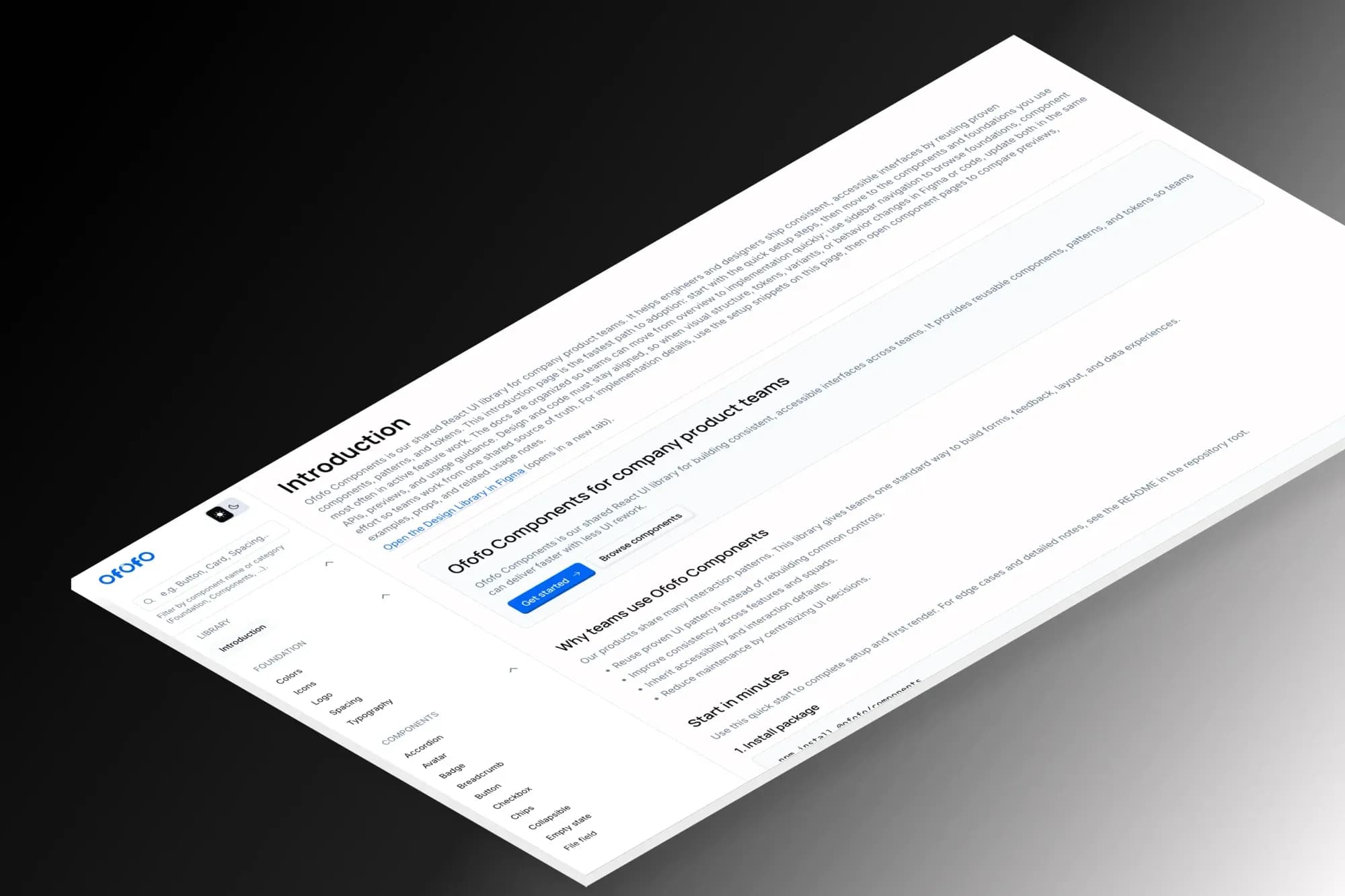
Claude Code collaborated at each stage while every visual and architectural call stayed with me. with Claude. Rather than starting from a blank artboard, Claude scaffolded component variants in Figma from the , generating the repetitive structure (size variants, state variants, interaction layers) so my time went to judgement: spacing, hover and focus states side by side, hierarchy across the full size range. The result was a 7-page Figma library covering Foundations, Buttons and Actions, Form , Feedback and Display, Cards, Overlays, and Navigation and Layout. Figma to code. Once the library was stable, Claude Code converted the designs to React 19 and TypeScript (strict) components, with for the token system and Radix primitives underneath. The motion system is spring-based and lives in hooks under src/lib/, not inline in JSX, which keeps components testable. Pull accuracy runs at roughly 90%, meaning that when an AI tool pulls a component from the library it matches Figma, renders correctly and leaves the surrounding layout alone. I scored that across all 70+ components, and the remaining 10% is always intentional: motion tuning, accessibility edge cases, and composed-pattern logic that needs human judgement. It is a different number from the 96% quoted elsewhere, which is adoption, the share of the team's work that comes out of the library rather than being rebuilt by hand. Hosted docs. The library needed a live reference, built with Vite and React on . Each page renders the actual component, not a screenshot, and the docs surface is driven by a typed registry.ts so docs and code cannot drift: any change to a component's forces a docs update. Live at ofofocomponents.ofofo.workers.dev. Publishing to . The final step made it usable in any React project. Published as @ofofo/components, it ships builds, full TypeScript types, and a so consumers get the complete token system without copying anything.What Shipped
146 base UI components covering every : Button, Input, Textarea, Select, Checkbox, RadioGroup, Toggle, Alert, Avatar, Card, Modal, Tooltip, Popover, Accordion, Tabs, Table, DropdownMenu, Progress, Skeleton, Slider, and more. 120 composed patterns built on those primitives: DataTable with row selection and pagination, StatsCard with sparkline and ring variants, AppCard, ComplianceCard, SiteNavbar, FeatureCard, BlogCard, TestimonialCard, CtaBanner, FaqSection. Token system with 23 colour variables across light and dark modes, 12 spacing and radius variables, a from overlay to toast, and a 7-step type scale. library with variants matching the React exactly: Button (32 variants), Avatar (40), Label (30), StatsCard (6), AppCard (5), Modal (4), Toast (5). are in active development.Platform Evolution
Lessons
Figma-code parity requires discipline, not just tooling. Tools can speed it up, but parity only holds if you enforce it as a rule. Every change to a component needs a matching code update and vice versa.FAQ
Accessibility on interactive components (focus trapping in modals, keyboard navigation in dropdowns, ARIA roles on toggles) is complex and easy to get subtly wrong. Radix handles all of that correctly and is actively maintained. Building it from scratch would have taken months of ongoing work. Radix let me focus on the token system, motion, and visual layer instead.
Yes, it is MIT licensed. Install with npm install @ofofo/components, import the stylesheet, and use any component directly. The Tailwind preset is optional but gives you the full token system if you want to write custom components that match the design language.
The primary target is expanding the generative UI layer: components that accept a data schema and render the appropriate UI without manual wiring. The aim is to let Claude generate full product screens from structured input, with the design library acting as the constraint that keeps everything on-brand. Beyond that, an interactive prop playground on the docs site and Code Connect wiring in Figma so developers can copy production-ready component code directly from inspect.