Gupshup RCS Portal: A Self-Serve Console for Launching Brand Messaging Across Carriers
Mohammed Zabeeh·September 12, 2022·16 min read
An end-to-end product design for Gupshup's RCS platform: the developer console where a brand signs up, builds a verified bot, tests it on real devices, launches it across carriers in 37 countries and runs campaigns, plus the internal review console that verifies, approves, and governs every one of those bots.
120+
Screens designed
2
Consoles
37 countries
Coverage
4
Bot lifecycle stages
Client
Gupshup
Role
Product Designer
Timeline
2022
Type
Enterprise
What this project was
Execution work rather than an investigation, so there is no method to report. Here is the honest shape of it.
What I owned
The user interface end to end for both consoles, the self-serve developer side and the internal review side, across more than 120 screens and 37 countries of carrier coverage.
What was not done
No user research and no measured outcome. Every figure inside the screenshots on this page is sample data used to design against, not a result.
The one UX decision
The phone preview renders the message live, in light and dark, while the template is being written, so a constraint is met at the moment of authoring rather than at review.
What I would measure now
First-pass review approval rate, and the time from signup to a first live bot.
What RCS Is
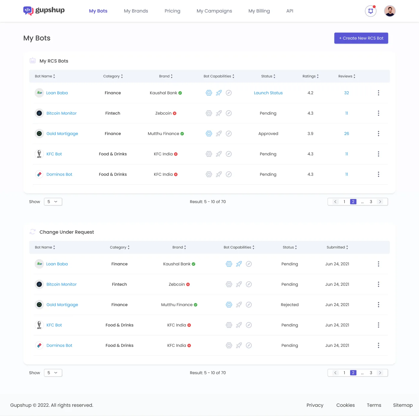
is the upgrade to SMS. Instead of 160 grey characters from an unknown number, a verified brand sends rich cards, carousels, buttons and images from a name and logo the has vouched for. It is the channel behind the branded, blue-checkmark business messages in your default messaging app.The catch is everything that has to happen before that first message goes out. A bot has to be created, branded, submitted for verification, validated against a 's technical signature, approved, then launched on each carrier individually, in each country, each with its own pricing and rules. Google's and the 's RBM are different signatures, and a bot live in India is not automatically live on AT&T in the United States. Gupshup sits in the middle of that complexity, and the brief was to turn it into something a developer could drive alone.The spine is a four-stage bot lifecycle. Every RCS bot moves through 4 states, in order, and they never reorder: Bot Creation, Development, Verification, Launch. That sequence became the stepper at the top of the bot dashboard, the reason "My Bots" needed a Status column rather than a live/offline toggle, and the reason there are six dashboard layouts, one per in-between state. Navigation, empty states, status badges, what is editable and what is locked all key off where the bot sits on that line.The My Bots console listing bots with status, brand verification, ratings and reviews.
Onboarding
The signup screen tells a developer what they are signing up for in a single breath. The headline does the lifting: "Get access to APIs to send and receive messages to and from users in over 37 countries." The form is deliberately small: email, a terms checkbox, create account. Asking for a company address and a timezone on the first screen is how you lose a developer who only wanted to see if the thing is real.The signup screen with a clear value proposition and a minimal account creation form.The heavier ask arrives only after email verification, and it is framed honestly. Personal details, then business details, split into clearly labelled groups. Phone number carries an inline Verify action and a sensibly defaulted country code. Country, state, city and timezone are dependent dropdowns. None of it is fun to fill in, so the "why" stays visible at the top.The Complete your details form, grouped into Personal Details and Business Details.
Building a Bot
The "Submit Your Bot Details" flow is the densest screen in the product, and it had to stay legible while carrying regulated weight. The bot name has a 40-character ceiling because that is the width of a phone's conversation header, and the helper text says so, turning a limit into context. Brand colour is validated for contrast, not just picked: choosing a colour computes its against white and warns in line when it falls below 4.5:1, because once the brand launches that colour is on every message header. The form speaks the platform's real vocabulary: Transactional versus Promotional, the RBM API versus the Google , a that "needs to be active and should respond with a 200 OK to POST requests." Helper text teaches a first-timer without slowing an expert down.The Submit Your Bot Details form with branding assets, contrast-validated colour and API selection.Universal gets a live preview. RCS does not reach iPhones and older Android devices, so URCS is an SMS fallback that gives non-RCS users an RCS-like experience. Enabling it reveals an SMS content field beside a phone mockup that previews exactly what the fallback recipient will see. For a brand that is the difference between reaching 80% of a list, a sample figure written into the mock-ups, and reaching all of it. The flow is a two-step stepper, RCS Bot Details then Carrier Selection, so the load is chunked rather than dumped on one page. Carrier Selection is its own interface problem: a bot can launch on dozens of carriers across dozens of countries, so the picker is a two-pane filter, countries with flags on the left, a searchable, alphabetised list of carriers on the right, selected ones as removable chips with a running count.The Carrier Selection step: a country filter beside a searchable carrier list, with selected carriers as chips.Templates are what the bot actually says. The editor pairs a form with a live phone preview, so the author sees the message taking shape as a real RCS card while writing it. Text fields offer +Add Variable so a template is personalised per recipient rather than rewritten per send. Suggestion buttons are the interactive heart of RCS: each has a Type of Action and the form reshapes to match it, an Open URL asks for a URL, a Dial asks for a number, a Simple Reply just needs its reply text.The Add Template editor: a rich-card carousel form beside a live phone preview.Verification is where RCS stops being normal and becomes a compliance process. The "Submit Bot for Verification" flow is a four-step stepper: Bot Details and Experience, Brand Details, Business Verification, Payment. The first step alone shows how much carriers demand: screenshots and a demo video, a first-message URL conforming to a strict opt-in pattern, a tester-invite URL, and plain-language questions that are really policy gates, how you obtain opt-in, what triggers messages, what the bot sends when a user texts STOP. Every field carries helper text explaining why the needs it. Listing a launched bot in the public store is a separate, lighter submission.The 4-step Submit Bot for Verification flow asking for screenshots, demo video and opt-in handling.
The Bot Dashboard
A single dashboard layout had to show a bot at any point on the 4-stage lifecycle, from "creation in process" to fully launched. The lifecycle stepper sits up top so state is the first thing you read, and status cards below it each answer one question. Verification Status carries a hard truth in soft language: to change a verified bot's brand or launch information, you contact support, and the screen says so rather than letting a user discover it through a failed edit. Beneath the status row sit an Message Templates table and a Test Devices table with a real "No Test Devices" empty state rather than an empty grid that looks broken.The per-bot dashboard with the lifecycle stepper, API info, verification and launch status, templates and test devices.The Change-Under-Request model keeps a live bot both editable and governed. A live, verified bot is a regulated public identity across 37 countries, so you cannot let someone quietly change its brand name or launch settings, and you cannot freeze it forever either. When a user edits a live bot the change becomes a request with its own status, Pending or Rejected, and its own submitted date, sitting in a second "Change Under Request" table on My Bots alongside the current live version. The live bot keeps running on its approved configuration while the proposed change moves through approval separately.Testing makes the on-device check the natural step, not the skippable one. A user registers test devices, picks a template and sends it. The interesting work is in variables: none, filled in by hand, or driven by an uploaded sheet for bulk testing, with a downloadable table to structure the sheet and a preview of the filled result before anything sends. Same discipline as the contrast check, catch the problem before a message reaches a real person.The test flow sending a template to a registered device with variable substitution.
Campaigns and Billing
Campaigns are the point, and and bots are the setup. The campaign list is a scannable table with scheduling that supports both Run Now and Run Later, and confirmation dialogs that distinguish the two so an immediate send is never an accident.The My Campaigns table listing campaigns with run time, IDs, bots, templates, status and report links.The engagement report makes a dense pile of delivery telemetry tell a story. The report reads as a funnel top to bottom: total messages on a stacked bar of and URCS, then delivery and read rates per channel, then responses and button-level interactions, then conversion in a donut. Failure is shown specifically: not a bare "Failed" but "Campaign reached 66% completion before Failure," naming the reason, "Error in Payment Processing," because a status with a cause is something a user can act on. And every percentage carries its absolute number, "Delivered 15,000 (75%)." Both are sample values written into the mock-ups to design against, not measured results.The Campaign Engagement Dashboard showing delivery funnels across RCS and URCS, responses and conversion.RCS pricing is a matrix, not one number: per , per country, per message type, split between domestic and international rates. Rather than bury it in a PDF, the Pricing screen presents carriers as a browsable grid of recognisable logos, and selecting one reveals its rate table, Rich , Single Message, Conversation, P2A Conversation, plus setup and annual fees, each with domestic and international columns. Billing mirrors that structure with a graphical view, so spend maps directly to the carriers and message types chosen.The Pricing screen showing carriers as cards with a per-carrier domestic and international rate table.
The Review Console
A second console behind the developer side makes its "Pending" and "Rejected" statuses mean something. The admin home is built around 4 queues, not one list: Submitted Bots, Pending for Approval by Carrier, Approved Bots and Rejected Bots, each its own table, so a reviewer knows what needs attention versus what is waiting on someone else.The admin Bots review screen with Submitted, Pending, Approved and Rejected queues and an SLA due-date column.The Due column puts the clock on the screen. Each pending bot shows how long until its review is due, counting down and turning red when it goes overdue, so the is a shared, visible problem rather than a silent stall. The same queue pattern repeats for Bot Launch, Bot Store Listing and Template Verification, so a reviewer learns one screen and works all 4. Opening a submission gives the reviewer the entire bot read-only, exactly as the developer built it: bot type, branding, colour, contacts, the and , the URCS preview, and the full list, with logo and banner downloadable for checking against carrier guidelines.The Bot Verification Details screen showing the full submission read-only with Recommend and Reject actions.The heart of the console is the conversation, not the Recommend and Reject buttons. A review is rarely a clean yes or no. Usually it is "fix the logo and resubmit." Each submission carries a ticketed comment thread with its own ID, where reviewer and developer attach screenshots and resolve issues against the actual submission. This thread is the real mechanism behind the developer side's Change-Under-Request status. Every decision is kept in history so the trail of who approved what, and why, never gets lost. Role-based access decides who is allowed to press Reject. An admin invites users by email and assigns a permission level, View or Edit, and a role, with the invite lifecycle from pending to active designed out.The threaded comments modal on a submission, a ticketed conversation with an attachment.
The System Underneath
A product this size only holds together if it is built from shared parts. The console runs on a component library: one input, one dropdown, one table with sortable headers and pagination, one stepper, one set of dialogs, one status-badge vocabulary used identically on every screen. That is what lets 120+ screens across the two consoles feel like one product rather than two.The Manage Users screen with role-based View or Edit permissions and Developer or Product Manager roles.
Platform Evolution
Lifecycle
The 4-stage spine
Creation, Development, Verification, Launch, named before any screen was drawn.
Onboarding
Self-serve front door
A near-frictionless signup, with the heavier details deferred.
Build
Bot creation, templates, testing
Contrast-gated branding, the template editor, and on-device testing.
Governance
Verification and Change-Under-Request
4-step carrier verification, plus tracked changes on live bots.
Campaigns
Scheduling, reporting, billing
Run-now and run-later sends, the engagement funnel, the pricing matrix.
Admin
The internal review console
Reviewer queues with SLA clocks, ticketed threads, role-based access.
Lessons
Design the lifecycle before the screens.
Naming the 4 bot states up front gave every later screen a backbone.
Surface the hard truths, do not hide them.
Webhooks needing a 200 OK, verified bots being locked, the GSMA-versus-Google choice. Helper text turns each trap into a lesson.
Catch problems at the cheapest moment.
Contrast validated at colour-pick time, tested on real devices, a confirmation that distinguishes Run Now from Run Later.
"Editable" and "governed" are not opposites.
Keeping the live version and the proposed change visibly separate, each with its own status, let a live bot be both.
FAQ
RCS does not reach every device, iPhones and older Android phones do not have it. URCS is an SMS-based fallback that gives those users an RCS-like experience, so a brand reaches its whole list instead of only the RCS-capable slice. In the design it is a first-class option with its own live preview on the create screen and its own line in every engagement report.
The Submit Your Bot Details form. It defines a brand's public identity, so it carries branding assets, a contrast-validated colour, API and webhook configuration, multiple contact methods, and the URCS fallback, all on one surface. Keeping it legible while it stayed honest about its technical weight was the core challenge.
Design Skills
Information ArchitectureUser FlowsInteraction DesignData VisualisationDesign SystemsAccessibility (WCAG)Prototyping