UX Case StudyProduct DesignDashboardData Visualisation
Gupshup Partner Portal: One Console for Every WhatsApp Business Account
Mohammed Zabeeh·November 8, 2021·12 min read
An enterprise portal that lets a Gupshup partner manage and track all of their clients' WhatsApp Business accounts in one place: opt-ins, message templates, business profiles, delivery reports, and a full analytics suite, designed from wireframes through to final UI.
40+
Screens designed
7
Core modules
4
Analytics views
Multi-account
Accounts
Client
Gupshup
Role
Product Designer (UX/UI)
Timeline
2021
Type
Enterprise
What this project was
Execution work rather than an investigation, so there is no method to report. Here is the honest shape of it.
What I owned
The user interface end to end, across roughly 40 screens and 7 modules: a multi-account dashboard, three analytics views, template authoring with a live preview, and profile health.
What was not done
No user research and no measured outcome. Every figure inside the screenshots on this page, including the 78% quality score and the 25% delta, is sample data used to design against, not a result.
The one UX decision
The template builder carries each WhatsApp constraint as helper text at the field it applies to, with the phone preview rendering live beside it, so a partner passes review by filling the form correctly rather than by trial and rejection.
What I would measure now
Template first-pass approval rate, and support tickets before and after.
What It Solves
Gupshup's partners are not single businesses. They are enterprises and resellers who run WhatsApp messaging on behalf of many client companies at once. Each of those clients is a separate , with its own phone number, its own , its own , its own , and its own set by WhatsApp.Answering that took 40+ screens across 7 modules. Before this portal, keeping track of all of it meant living in spreadsheets and responses. There was no single place to answer the questions a partner asks every morning: which accounts sent well yesterday, which template is doing the work, whose is slipping, whose phone number got flagged, and who needs a report by end of day.The Partner Portal answers those questions. Its login screen states the promise plainly: "Manage and track all your WhatsApp business accounts all at one place." The hard part was never a single screen. It was making many accounts feel like one coherent thing to manage.
Wireframes to UI
The file keeps both halves of the build: a discussion-and-wireframes canvas where the structure was argued out, and a final UI canvas where it was made real.Grayscale wireframe of the template builder, annotated with WhatsApp's field-level rules.The wireframes were deliberately grayscale and deliberately detailed. The template builder wireframe above already carries the real constraints in its annotations: template names can only contain letters, numbers, and underscores, the footer has a 60-character limit and does not support variables, languages can be added or removed later. Settling those rules in low fidelity, before a single colour or shadow was chosen, is what let the final UI move fast and stay correct. The visual layer changed a lot between the two canvases. The barely moved, because it had already been stress-tested in gray.
Login and Dashboard
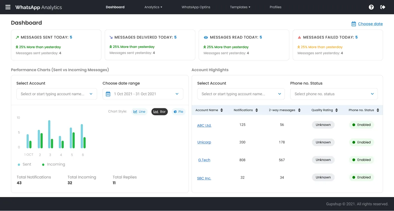
The login does one thing well. A product name, Enterprise Partner Portal, one line of value, an illustration of the channels the portal touches, then a username, a password, and a button.The login screen pairs the product name and value line with a minimal form.The dashboard is the morning briefing. Across the top sit 4 cards, messages sent, delivered, read, and failed today, each compared against yesterday so a number is never shown without context. A count alone says nothing. "5, up 25% on yesterday" tells a story, and that 25% is sample data in the design rather than a measured result.The dashboard: KPI cards, a sent-versus-incoming chart, and an account highlights table.Below that, the screen splits into the two things a partner needs at a glance. On the left, a Performance Chart comparing sent versus incoming messages, with an account filter, a date range, and a Line / Bar / Pie toggle so the same data can be read whichever way suits the question. On the right, an Account Highlights table, one row per account, showing notifications, two-way messages, , and phone-number status side by side. That table is the heart of "all in one place": a partner can scan every client's health in a single glance and click into whichever one needs attention.
Analytics Suite
Messaging on WhatsApp is measured along a few distinct axes, and rather than cram them into one overloaded screen, the portal splits them across 3 focused views under a shared Analytics structure. Every view keeps the same shape, account selector, date range, a chart with a Line / Bar / Pie toggle, a summary panel, and a Download Report button, so moving between them feels like changing the question, not learning a new screen.Notification analytics answers how outbound landed. Notifications are the business-initiated, template messages a brand sends out. This view charts sent versus delivered, breaks messages down by type (text, image, video, document), states the average delivered percentage with a plain-language verdict ("78%, Good", a sample value shown in the design), and ranks the most-used so a partner can see which messages are pulling their weight.Notification analytics charts sent versus delivered, message types, and the most-used templates.Incoming analytics is the mirror image: what came back. This view is about the two-way conversation, total incoming, total replies, response rate with its own verdict, and the more human signals that only conversation reveals, the active response period (when people actually reply) and the most active day of the week. It ranks the most effective templates by how much incoming conversation they triggered, a very different ranking from "most sent."Incoming analytics shows two-way volume, response rate, and the most effective templates.Opt-ins are their own first-class view. On WhatsApp, the right to message someone is permission you earn and can lose. Today's opt-ins and opt-outs sit up top with a running total, and the chart plots the two against each other over time, with averages and the single best opt-in day called out. When opt-outs start crossing opt-ins on that chart, a partner sees the problem before it becomes a quality-rating problem.The opt-ins view charts opt-ins against opt-outs over time, with totals and averages.
Templates
Template management leads with WhatsApp's approval reality. Every template a brand sends has to be approved and carries a status, and a partner managing dozens of accounts can have hundreds in flight. A row of status filters sits across the top, Enabled, Disabled, Flagged, Review pending, Rejected, each with a live count, so a partner can jump straight to "show me everything that got rejected" without scrolling a single table. The table is sortable throughout, with an account selector and search above. It makes a large, messy, constantly-changing inventory feel governable.Template management with status-filter chips, an account selector, and a sortable templates table.The builder teaches WhatsApp's rules without making them feel like rules. It pairs a structured form with a live phone preview that renders the message as a real WhatsApp chat bubble, complete with a Light / Dark toggle so a partner sees the message the way their end-user will.The template builder pairs a structured form with a live light and dark phone preview.The form mirrors WhatsApp's own template anatomy exactly: pick an account, name the template (letters, numbers, underscores only), choose a category and content type, set a language, then build the message from an optional header (60 characters), a body, an optional footer (60 characters, no variables), and interactive buttons that let customers reply or take action. Every field carries its constraint in helper text, so the partner learns WhatsApp's rules by filling the form correctly the first time rather than by getting a template rejected and wondering why.
Profiles and Reports
The Profile screen is a single account's identity and health. Pick an account and the left column shows its editable business information, vertical, description, contact details, address, mail-alert and URL configuration, while the right side lays out the WhatsApp-specific status as a grid of cards.Profile management sets editable business info beside a grid of WhatsApp health cards.Those cards are the things a partner cannot afford to lose track of: the (Green / Yellow / Red, WhatsApp's own health signal), the messaging limit (unique contacts per rolling 24 hours), and the account IDs, one-tap copyable because a partner pastes them into support tickets and calls all day. One screen turns a scatter of WhatsApp and Facebook settings into a legible account dossier.Reports are modelled as an async queue. Pulling a delivery report over a month of messaging is not instant, so the portal treats reporting honestly, as a request that gets queued, processed, and downloaded when ready, rather than pretending a heavy export can happen in a click.The reports queue shows requests as Pending, Error, and Ready with download links.A partner places a new report request, scoped by account, type, and date range, and it joins a table where each row carries a status: Pending while it builds, Error if it fails, and Ready with a download link when done. The pattern sets the right expectation, a report is something you ask for and collect, and it makes a slow backend operation feel like a tracked task instead of a frozen screen.
One System
40+ screens across 7 modules only feel like one product because they are built from one kit. A single top navigation, one account-selector pattern that behaves identically on every analytics view, one date-range control, one table style with sortable headers and status pills, one chart component with its Line / Bar / Pie toggle, and one status vocabulary, Green / Yellow / Red, Pending / Ready / Error, used the same way everywhere.
Platform Evolution
Wireframes
Structure settled in gray
Navigation, the template builder's field rules and the multi-account model, argued out in grayscale.
Foundation
Login and the daily dashboard
4 KPI cards with day-over-day deltas, a performance chart, and the Account Highlights table.
Analytics
3 views, one skeleton
Notification, Incoming and Opt-in analytics, each a focused screen on one shared skeleton.
Authoring
Templates and account profiles
Template authoring with a live light/dark phone preview, status-filtered management, and the profile dossier.
Delivery
Async reports and the shared kit
A queued report model with Pending/Ready/Error statuses, and one component kit so 40+ screens read as one product.
Lessons
Settle the structure in gray.
Never show a number without its context.
Teach the platform's rules inside the form.
The template builder encodes WhatsApp's real constraints as helper text on every field, so partners pass approval by filling the form correctly rather than by trial and rejection.
Be honest about slow work.
Modelling reports as a queued request with Pending / Ready / Error status set the right expectation, instead of hiding a heavy export behind a button that looks instant and is not.
FAQ
WhatsApp messaging is measured along genuinely different axes: outbound notification delivery, inbound two-way conversation, and opt-in/opt-out permission. Each answers a different question, so each gets its own focused screen. They share one skeleton, account selector, date range, chart with Line/Bar/Pie toggle, summary, and download, so moving between them feels like changing the question, not learning a new screen.
It is WhatsApp's own health signal for a business number, shown as Green, Yellow, or Red. A slipping rating predicts messaging restrictions, so the portal surfaces it prominently on both the dashboard's account table and each account's profile, where a partner can catch it early.
It mirrors WhatsApp's exact template anatomy, category, content type, language, header, body, footer, and buttons, and puts every constraint in helper text right where the decision is made (name format, 60-character footer with no variables, and so on). A live phone preview with light and dark modes shows the result as a real chat bubble. The goal is to pass approval on the first submission.
Design Skills
Information ArchitectureWireframingData VisualisationInteraction DesignDesign SystemsUX Writing